The following diagram shows the movement of U.S. households among three income groups - affluent, middle class, and poor - over the 12-year period 1965-1977. Assuming that the trend shown was to continue, what percent of households classified as affluent in 1965 were predicted to become poor in 1989 (Give your answer to the nearest .) According to the model, what percentage of all U.S. households will be in each income bracket in the long term (Give your answer to the nearest percent.) 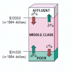 , , ,
, , ,
A) 6% of households classified as affluent in 1965 were predicted to become poor in 1989. In the long term: Affluent: 22.9%; Middle class: 39.1%; Poor: 38.1%
B) 1.8% of households classified as affluent in 1965 were predicted to become poor in 1989. In the long term: Affluent: 30.1%; Middle class: 5.9%; Poor: 64%
C) 6% of households classified as affluent in 1965 were predicted to become poor in 1989. In the long term: Affluent: 30.1%; Middle class: 5.9%; Poor: 64%
D) 0% of households classified as affluent in 1965 were predicted to become poor in 1989. In the long term: Affluent: 30.1%; Middle class: 5.9%; Poor: 64%
E) 0% of households classified as affluent in 1965 were predicted to become poor in 1989. In the long term: Affluent: 15.6%; Middle class: 72.3%; Poor: 12.1%
Correct Answer:
Verified
Q7: You are given a transition matrix
Q8: You are given a transition matrix
Q9: You are given a transition matrix
Q10: Write down the transition matrix associated
Q11: You are given a transition matrix
Q13: Tommy the dunker's performance on the
Q14: Adoptions College instructors who adopt this
Q15: The following diagram shows the movement
Q16: You are given a transition matrix
Q17: A University of Kansas study shows
Unlock this Answer For Free Now!
View this answer and more for free by performing one of the following actions

Scan the QR code to install the App and get 2 free unlocks

Unlock quizzes for free by uploading documents