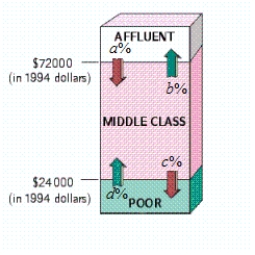
The following diagram shows the movement of U.S. households among three income groups - affluent, middle class, and poor - over the 11-year period 1978-1989.
 ? , , , ?
Use the transitions shown in the diagram to construct a transition matrix (assuming zero probabilities for the transitions between affluent and poor).
Take 1 = Affluent, 2 = Middle class, 3 = Poor.
Assuming that the trend shown was to continue, what percent of households classified as affluent in 1978 were predicted to become poor in 2000 (Give your answer to the nearest 0.1%.)
The answer is __________%
According to the model, what percentage of all U.S. households will be in each income bracket in the long term (Give your answers to the nearest 0.1 percent.)
Percent of affluent is __________%
Percent of middle class is __________%
Percent of poor is __________%
Correct Answer:
Verified
View Answer
Unlock this answer now
Get Access to more Verified Answers free of charge
Q28: The following diagram shows the movement
Q29: You are given a transition matrix
Q30: Use Bayes' theorem or a tree
Q31: You are given a transition matrix
Q32: Write down the transition matrix associated
Q34: Use Bayes' theorem or a tree
Q35: Any athlete who fails the Enormous State
Q36: Write down the transition matrix associated with
Q37: A University of Montana study shows
Q38: In 2001, 37.4% of all light
Unlock this Answer For Free Now!
View this answer and more for free by performing one of the following actions

Scan the QR code to install the App and get 2 free unlocks

Unlock quizzes for free by uploading documents