The figure below shows the aggregate demand and supply curves for the U.S.The figure given below shows that between period 1 and period 2 nominal GDP changed from $40,000 to: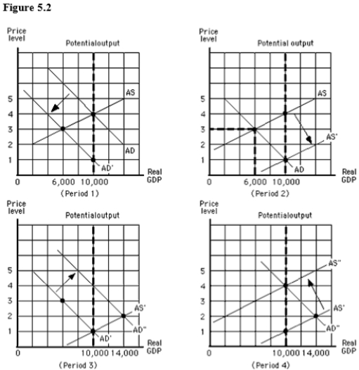
A) $18,000 and back again.
B) $18,000 and stayed there.
C) $18,000 in period 1 and to $10,000 in period 2.
D) $10,000 in period 1 and stayed there in period 2.
E) $10,000 in period 1 and to $18,000 in period 2.
Correct Answer:
Verified
Q87: Keynes believed that the best method for
Q88: The figure below shows the aggregate demand
Q89: An increase in government spending,other things constant,will
Q90: Which of these economic changes was observed
Q91: According to Keynes,in order to get the
Q93: The figure below shows the aggregate demand
Q94: The concept of "invisible hand" introduced by
Q95: According to Keynes,the adoption of an expansionary
Q96: The Keynesian approach to fiscal policy calls
Q97: The Keynesian approach to economic policy is
Unlock this Answer For Free Now!
View this answer and more for free by performing one of the following actions

Scan the QR code to install the App and get 2 free unlocks

Unlock quizzes for free by uploading documents