The figure given below represents the effects in the labor markets due to migration. Here the world has been divided into a high-income "North" (left panel) and a low-income "South" (right panel) . Dn and Sn are the labor demand and the labor supply curves in North. Ds and (Sr + Smig) are the labor demand and pre-migration labor supply curves in South. Sr is the post-migration labor supply curve in South. The value c is the cost of migrating. 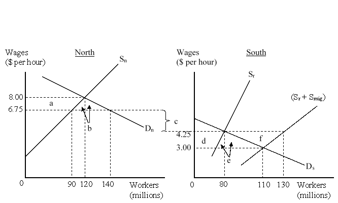 After the migration, the native employees in North:
A) lose welfare given by area 'a'.
B) gain welfare given by area (a+b) .
C) lose welfare given by area (a+b) .
D) lose welfare given by area (e + f) .
Correct Answer:
Verified
Q21: The figure given below represents the effects
Q22: One measure that would compensate the sending
Q23: _ is the movement of people from
Q24: The figure given below represents the effects
Q25: Which of the following is true of
Q27: Which of the following is a likely
Q28: The figure given below represents the effects
Q29: Which of the following groups are positively
Q30: Which of the following was among the
Q31: Which of the following is most likely
Unlock this Answer For Free Now!
View this answer and more for free by performing one of the following actions

Scan the QR code to install the App and get 2 free unlocks

Unlock quizzes for free by uploading documents