The following graph shows the average grade point average for a particular college from 2006 until 2013.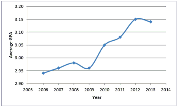
A) Average GPA is the dependent variable in the graph.
B) Historically, the Average GPA of the college tends to decrease.
C) There appears to be no relationship between Year and Average GPA.
D) Year is the dependent variable in the graph.
Correct Answer:
Verified
Q1: ---------charts are a specific type of bar
Q2: The ---------- graphs the midpoint of each
Q3: A stem and leaf display most resembles
Q5: The class---------- is the breadth, or range,
Q6: The class------- represent the minimum and maximum
Q7: Class ------ are the number of observations
Q8: When you want to compare the shape
Q9: Which of the following is not a
Q10: In Excel, contingency tables are known as
Q11: --------totals the proportion of observations that are
Unlock this Answer For Free Now!
View this answer and more for free by performing one of the following actions

Scan the QR code to install the App and get 2 free unlocks

Unlock quizzes for free by uploading documents