The following graph shows the curb weight of seven cars, in pounds, along with their corresponding highway miles per gallon.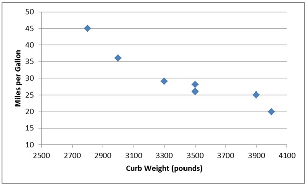
A) Miles per gallon is the independent variable in the graph.
B) As the curb weight increases, the highway miles per gallon tend to increase.
C) Curb weight is the dependent variable in the graph.
D) As the curb weight increases, the highway miles per gallon tend to decrease.
Correct Answer:
Verified
Q13: A data set has 60 observations with
Q14: A--------- chart is a special type of
Q15: A(n)---------- is a category in a frequency
Q16: --------------data are values based on observations that
Q17: ---------group several values in a single column
Q19: The following graph shows the curb weight
Q20: --------display the proportion of observations of each
Q21: A data set has 60 observations with
Q22: The----- is a line graph that plots
Q23: The goal of constructing a frequency distribution
Unlock this Answer For Free Now!
View this answer and more for free by performing one of the following actions

Scan the QR code to install the App and get 2 free unlocks

Unlock quizzes for free by uploading documents