The following chart shows the average number of hours commuters spend in traffic delays per year at the six most congested cities in the U.S.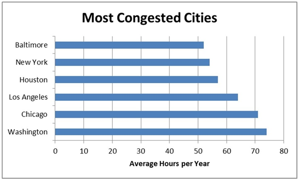
A) Houston commuters have a higher average number of hours spent per year in traffic delays when compared to New York commuters.
B) Chicago commuters have the highest average number of hours spent per year in traffic delays.
C) Baltimore commuters have the lowest average number of hours spent per year in traffic delays.
D) Los Angeles commuters have a lower average number of hours spent per year in traffic delays when compared to Washington commuters.
Correct Answer:
Verified
Q33: Pareto charts also plot the cumulative relative
Q34: ----------classes are classes with boundaries that do
Q35: The dependent variable in a scatter plot
Q36: Fifty employees at CSC Corporation responded to
Q37: Clustered bar charts are preferred over stacked
Q39: Histograms displaying continuous data have gaps between
Q40: Empty classes for a frequency distribution using
Q41: When creating a frequency distribution with grouped
Q42: Choose a pie chart rather than a
Q43: The cumulative percentage polygon is a line
Unlock this Answer For Free Now!
View this answer and more for free by performing one of the following actions

Scan the QR code to install the App and get 2 free unlocks

Unlock quizzes for free by uploading documents