The following chart shows the average number of hours commuters spend in traffic delays per year at the six most congested cities in the U.S.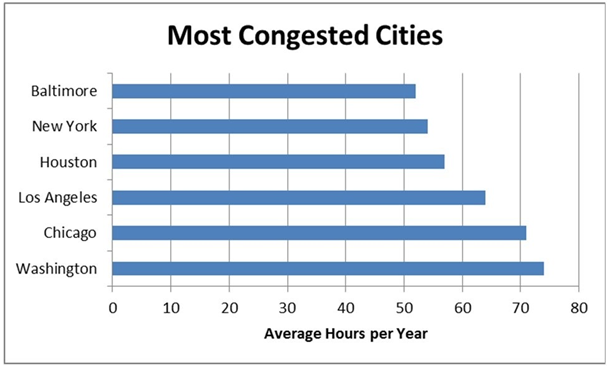
A) vertical bar chart.
B) horizontal bar chart.
C) Pareto chart.
D) stacked bar chart.
Correct Answer:
Verified
Q26: Under no circumstances should open- ended classes
Q27: A------- is a graph showing the number
Q28: Use a------- chart if you want to
Q29: ----------are values that can take on any
Q30: Bins in Excel represent the
A)upper boundary of
Q32: ---------group several values side by side within
Q33: Pareto charts also plot the cumulative relative
Q34: ----------classes are classes with boundaries that do
Q35: The dependent variable in a scatter plot
Q36: Fifty employees at CSC Corporation responded to
Unlock this Answer For Free Now!
View this answer and more for free by performing one of the following actions

Scan the QR code to install the App and get 2 free unlocks

Unlock quizzes for free by uploading documents