The graph below shows the number of car accidents occurring in one city in each of the years 2011 through 2016. The number of accidents dropped in 2013 after a new speed limit
was imposed. Does the graph distort the data? How would you redesign the graph to be less
misleading? 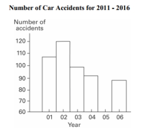
Correct Answer:
Verified
View Answer
Unlock this answer now
Get Access to more Verified Answers free of charge
Q43: The frequency table below shows the
Q44: Describe how a data point labeled as
Q45: The following data set represents Heather's
Q46: Kevin asked some of his friends
Q47: Graphs should be constructed in a way
Q49: A school district performed a study
Q50: Describe the differences between a histogram and
Q51: The data shows the roundtrip mileage
Q52: Define the difference between a Relative Frequency
Q53: In a survey, 26 voters were
Unlock this Answer For Free Now!
View this answer and more for free by performing one of the following actions

Scan the QR code to install the App and get 2 free unlocks

Unlock quizzes for free by uploading documents