The graph below shows the number of car accidents occurring in one city in each of the_
years 2011 through 2016. The number of accidents dropped in 2013 after a new speed limit
was imposed. Does the graph distort the data? How would you redesign the graph to be less
misleading? 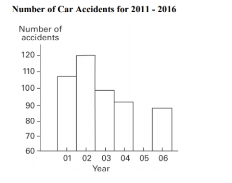
Correct Answer:
Verified
View Answer
Unlock this answer now
Get Access to more Verified Answers free of charge
Q36: The frequency distribution below summarizes the
Q37: The ages of the 45 members
Q38: The Kappa Iota Sigma Fraternity polled its
Q39: The following frequency distribution displays the
Q40: The following data show the number
Q42: A school district performed a study
Q44: Describe how a data point labeled as
Q44: The frequency distribution below summarizes the
Q46: The following data set represents Heather's
Q59: Explain in your own words why a
Unlock this Answer For Free Now!
View this answer and more for free by performing one of the following actions

Scan the QR code to install the App and get 2 free unlocks

Unlock quizzes for free by uploading documents