The following graph shows the number of car accidents occurring in one city in each of the years 2006 through2011 (Year 1 = 2006, Year 2 = 2007 etc). The number of accidents dropped in 2008 after a new speed limit wasimposed. How is the bar graph misleading? How would you redesign the graph to be less misleading? 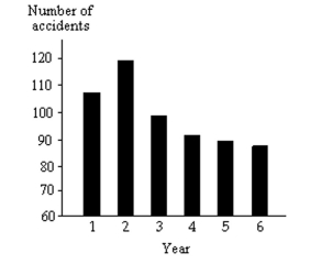
Correct Answer:
Verified
View Answer
Unlock this answer now
Get Access to more Verified Answers free of charge
Q72: Q73: The grade point averages for 40 Q74: The local police, using radar, checked Q75: The heights (in inches) of 30 Q76: The data below represent the consumption Q77: The April precipitation amounts (in inches) Q78: A frequency polygon always begins and ends Unlock this Answer For Free Now! View this answer and more for free by performing one of the following actions Scan the QR code to install the App and get 2 free unlocks Unlock quizzes for free by uploading documents![]()

