The bar graph below shows the number of car accidents occurring in one city in each of the years 2001 through 2006. The number of accidents dropped in 2003 after a new speed limit was imposed. Why is the graph misleading? How would you redesign the graph to be less misleading? 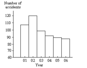
Correct Answer:
Verified
View Answer
Unlock this answer now
Get Access to more Verified Answers free of charge
Q44: Provide an appropriate response.
-A table of random
Q45: Construct the requested histogram.
-In a survey,
Q46: A random sample of federal income
Q47: Use limit grouping to organize these
Q48: Provide an appropriate response.
-Suppose you wanted
Q50: The heights of adult women have a
Q51: Shortly before an election, a market
Q52: Use cutpoint grouping to organize these
Q53: Construct a relative-frequency polygon for the
Q54: Provide an appropriate response.
-Suppose that a group
Unlock this Answer For Free Now!
View this answer and more for free by performing one of the following actions

Scan the QR code to install the App and get 2 free unlocks

Unlock quizzes for free by uploading documents