The graph below shows the number of car accidents occurring in one city in each of the years 2011 through
2016. The number of accidents dropped in 2013 after a new speed limit was imposed. Does the graph distort the
data? How would you redesign the graph to be less misleading? 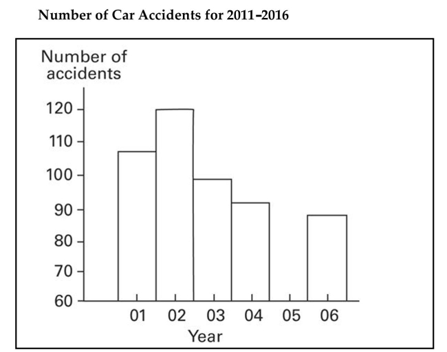
Correct Answer:
Verified
View Answer
Unlock this answer now
Get Access to more Verified Answers free of charge
Q47: Graphs should be constructed in a way
Q54: The frequency table below shows the
Q55: The following data set represents Heather's
Q56: The data shows the roundtrip mileage
Q57: The following figures represent Latisha's monthly
Q60: In a survey, 26 voters were
Q61: The frequency distribution below summarizes employee
Q62: Lori asked 24 students how many
Unlock this Answer For Free Now!
View this answer and more for free by performing one of the following actions

Scan the QR code to install the App and get 2 free unlocks

Unlock quizzes for free by uploading documents