The chart below can be best described as 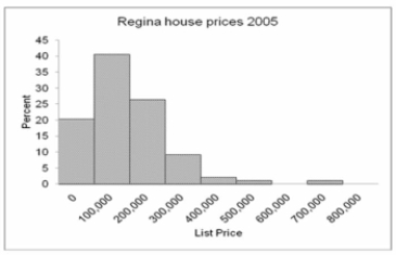
A) Frequency Polygon
B) Bar chart
C) Clustered bar chart
D) Stacked bar chart
E) Histogram
Correct Answer:
Verified
Q46: When a class interval is expressed as:
Q56: The first plot for a cumulative greater
Q57: What is the class midpoint for the
Q58: How many employees were absent six or
Q59: What is the class interval? _
A) 2
B)
Q60: What is the class interval?
A) 9
B) 10
C)
Q62: Which is the best (most informative and
Q63: The chart below can be best described
Q64: The grades on a statistics exam for
Q66: The Lake Ontario Credit Union selected a
Unlock this Answer For Free Now!
View this answer and more for free by performing one of the following actions

Scan the QR code to install the App and get 2 free unlocks

Unlock quizzes for free by uploading documents