This graph is one way of presenting data from a study. It shows the number of hours per week that people spent exercising. This type of graph is called a _____. 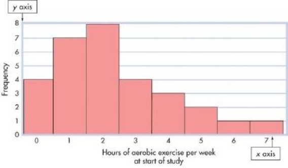
A) frequency polygon
B) scatter plot
C) standard normal curve
D) histogram
Correct Answer:
Verified
Q1: When Sarah created a frequency polygon, she
Q2: If you arrange raw scores in order
Q3: Marvin gathered data on the frequency of
Q5: Your textbook describes a research project concerned
Q6: This graphic representation of the data from
Q7: This graphic representation of the data from
Q8: Yoshiko decided to organize the data from
Q9: This graphic representation of the data from
Q10: A _ is like a bar chart
Q11: In a graph displaying family income in
Unlock this Answer For Free Now!
View this answer and more for free by performing one of the following actions

Scan the QR code to install the App and get 2 free unlocks

Unlock quizzes for free by uploading documents