(Figure: Interpreting Market Shifts) The graph shows how supply and demand changed between the years 2011 and 2012. The market experienced 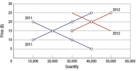
A) a decrease in demand and a decrease in supply.
B) an increase in demand and an increase in supply.
C) an increase in demand and a decrease in supply.
D) a decrease in demand and an increase in supply.
Correct Answer:
Verified
Q14: Willingness-to-pay is always equal to the price
Q15: Which item is most likely an inferior
Q16: (Table) Using the data in the table
Q17: Supply is defined as the _ over
Q18: Whenever you construct a demand curve, which
Q20: If both the supply of and the
Q21: If a market is NOT at equilibrium
A)
Q22: Which type of payment would NOT be
Q23: (Figure: Interpreting Market Equilibrium) If the price
Q24: (Figure: Predicting Market Shifts) Why is there
Unlock this Answer For Free Now!
View this answer and more for free by performing one of the following actions

Scan the QR code to install the App and get 2 free unlocks

Unlock quizzes for free by uploading documents