(Figure: Interpreting Market Shifts) The graph shows how supply and demand changed between the years 2011 and 2012. The final effect is that 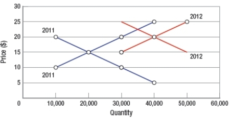
A) only price rose.
B) only quantity rose.
C) both price and quantity fell.
D) both price and quantity rose.
Correct Answer:
Verified
Q248: Sales of luxury consumer products for cats
Q249: (Figure: Interpreting Market Equilibrium) The equilibrium price
Q250: If both the supply of and the
Q251: An increase in demand is shown as
Q252: According to the law of demand, people
Q254: When economists refer to a market demand
Q255: The component common to all markets is
Q256: If bad weather persists in a summer
Q257: (Figure: Predicting Demand Shifts 2) What would
Q258: Which scenario is the MOST likely effect
Unlock this Answer For Free Now!
View this answer and more for free by performing one of the following actions

Scan the QR code to install the App and get 2 free unlocks

Unlock quizzes for free by uploading documents