Refer to Figure 53.4 and then answer the following questions.
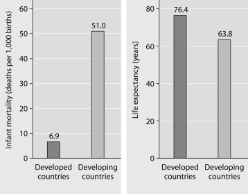
Figure 53.4: Infant mortality and life expectancy at birth in developed and developing countries (data as of 2005) .
-What is a logical conclusion that can be drawn from the graphs above?
A) Developed countries have lower infant mortality rates and lower life expectancy than developing countries.
B) Developed countries have higher infant mortality rates and lower life expectancy than developing countries.
C) Developed countries have lower infant mortality rates and higher life expectancy than developing countries.
D) Developed countries have higher infant mortality rates and higher life expectancy than developing countries.
E) Developed countries have a life expectancy that is about 42 years more than life expectancy in developing countries.
Correct Answer:
Verified
Q67: Which of the following statements about human
Q68: Which pair of terms most accurately describes
Q69: Scientific study of the population cycles of
Q70: The following questions refer to Figure 53.3,
Q71: A recent study of ecological footprints concluded
Q73: Refer to Figure 53.4 and then answer
Q74: The following questions refer to Figure 53.3,
Q75: Population ecologists follow the fate of same-age
Q76: A population's carrying capacity
A) may change as
Q77: According to the logistic growth equation
Unlock this Answer For Free Now!
View this answer and more for free by performing one of the following actions

Scan the QR code to install the App and get 2 free unlocks

Unlock quizzes for free by uploading documents