The graph shown represents the cost and revenue curves faced by a monopoly. 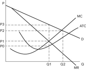 Comparing the perfectly competitive and monopoly outcomes, we can see that:
A) there is deadweight loss in the monopoly market.
B) a perfectly competitive firm would lose money in this industry.
C) a perfectly competitive firm would produce Q1 units.
D) a monopolist would charge P3 and a perfectly competitive firm would charge P1.
Correct Answer:
Verified
Q108: The monopolist chooses to produce:
A)where marginal cost
Q109: Public policy responses to monopolies:
A)sometimes aim to
Q110: With a monopolist's outcome, consumer surplus is
Q111: Two antitrust acts actively used by the
Q112: With a monopolist's outcome, producer surplus is
Q114: The monopolist's outcome happens at a _
Q115: In general, with a monopolist's outcome:
A)consumers lose
Q116: Which of the following is an example
Q117: The government uses antitrust laws:
A)to prevent all
Q118: The graph shown represents the cost and
Unlock this Answer For Free Now!
View this answer and more for free by performing one of the following actions

Scan the QR code to install the App and get 2 free unlocks

Unlock quizzes for free by uploading documents