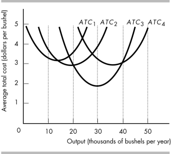
-The above figure represents the average total cost curves of a wheat farmer.
a) Which average total cost curve has the lowest average total cost of producing 30,000 bushels of wheat?
b) Over what range of output is the farmer experiencing economies of scale?
c) Over what range of output is the farmer experiencing diseconomies of scale?
d) Which average total cost curve has the lowest possible average cost of production?
e) Which average total cost curve represents the largest plant?
Correct Answer:
Verified
View Answer
Unlock this answer now
Get Access to more Verified Answers free of charge
Q459: What is the long-run average cost curve?
Q460: What is the relationship between the marginal
Q461: The marginal product of labor is defined
Q462: Marginal cost refers to the increase in
Q463: Q465: The marginal cost curve intersects the average Q466: The term "fixed cost" refers to the Q467: A firm's total cost in the short Q468: Q469: Unlock this Answer For Free Now! View this answer and more for free by performing one of the following actions Scan the QR code to install the App and get 2 free unlocks Unlock quizzes for free by uploading documents![]()
![]()
![]()

