The graph below illustrates the relationship between fishing effort and the catch of large predatory fish, like tuna, during the past 40 years. 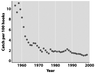
What best explains the pattern illustrated in this graph?
A) Fish are adaptive and eventually learn to avoid hooks.
B) Anthropogenic chemical, thermal, and sound pollution has greatly reduced the carrying capacity for large predatory fish.
C) Large predatory fish are at the top of their food webs where biomagnification produces the greatest impact.
D) Highly efficient harvesting technologies remove these fish species at rates much greater than the rates of natural replacement.
Correct Answer:
Verified
Q15: Intentionally supplementing nitrogen into a monoculture like
Q25: The single most significant human-caused contribution (about
Q28: What best describes the relationship between cutting
Q29: Why is the amount of nitrogen that
Q29: Which of the following cycles appears to
Q30: Biodeisel fuel is produced from oils synthesized
Q31: Global warming is likely to have much
Q34: The figure below shows the predicted distribution
Q36: What is the main reason that humans
Q38: What will happen in the future if
Unlock this Answer For Free Now!
View this answer and more for free by performing one of the following actions

Scan the QR code to install the App and get 2 free unlocks

Unlock quizzes for free by uploading documents