The graphs below display the average life expectancy for Americans according to the National
Center for Health Statistics. Which graph would you show if you were arguing that we're really not
living much longer than we were way, way back in 1985? 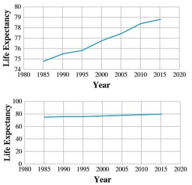
Correct Answer:
Verified
View Answer
Unlock this answer now
Get Access to more Verified Answers free of charge
Q164: Consider the survey question "Are you going
Q165: Consider the survey question "Do you think
Q166: An upcoming school levy in my town
Q167: For the following data
(a)Draw a scatter plot.
(b)Find
Q168: A stats instructor has recorded the scores
Q169: Consider the survey question "Do you feel
Q171: Draw a bar graph illustrating the change
Q172: A sample is one where members of
Q173: Consider the survey question "Are you in
Q174: Evaluate this claim by an advertiser: 64%
Unlock this Answer For Free Now!
View this answer and more for free by performing one of the following actions

Scan the QR code to install the App and get 2 free unlocks

Unlock quizzes for free by uploading documents