The line chart below shows tomato prices each month from January (month 1)to December last year ($ per pound). By looking at this chart you can see the lowest tomato prices occurred in July. 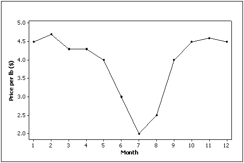
Correct Answer:
Verified
Q1: Experience shows that few students hand in
Q7: Correlation implies causation.
Q9: A skewed histogram is one with a
Q11: A cumulative relative frequency distribution lists the
Q18: A stem-and-leaf display reveals more information about
Q42: The graph below is an example of
Q45: Data for calories and salt content (milligrams
Q88: The two most important characteristics revealed by
Q89: The graphical technique used to describe the
Q92: When two variables are linearly related,and tend
Unlock this Answer For Free Now!
View this answer and more for free by performing one of the following actions

Scan the QR code to install the App and get 2 free unlocks

Unlock quizzes for free by uploading documents