Figure 8-18
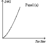
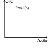
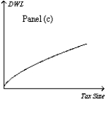
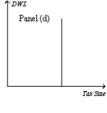
-Refer to Figure 8-18.Which graph correctly illustrates the relationship between the size of a tax and the size of the deadweight loss associated with the tax?
A) Panel (a)
B) Panel (b)
C) Panel (c)
D) Panel (d)
Correct Answer:
Verified
Q21: In which of the following instances would
Q27: Assume that for good X the supply
Q31: Assume that for good X the supply
Q36: Which of the following events is consistent
Q39: Which of the following events always would
Q40: The higher a country's tax rates,the more
Q44: Which of the following ideas is the
Q48: In the early 1980s,which of the following
Q334: Suppose the tax on gasoline is raised
Q341: Figure 8-19. The figure represents the relationship
Unlock this Answer For Free Now!
View this answer and more for free by performing one of the following actions

Scan the QR code to install the App and get 2 free unlocks

Unlock quizzes for free by uploading documents