Multiple Choice
Figure 33-5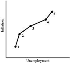
The data illustrated in Figure 33-5 would be most representative of which of the following decades?
A) The 1960s
B) The 1970s
C) The 1980s
D) The 1990s
Correct Answer:
Verified
Related Questions
Q103: In the 1990s, the rising value of
Q105: One reason why the Phillips curve "broke
Q110: Which of the following is most likely
Q111: One of the reasons why the Phillips
Q113: In the 1990s, the United States benefited
Q114: Which of the following led to the
Q118: Empirical research suggests that the steepness of
Unlock this Answer For Free Now!
View this answer and more for free by performing one of the following actions

Scan the QR code to install the App and get 2 free unlocks

Unlock quizzes for free by uploading documents