The following graphic is adapted from one in Wainer (1984) , plotting the number of private and public elementary schools (in thousands) in the U.S. between 1930 and 1970. Wainer was presenting it as a bad example, and I have made it worse. What is bad about this example?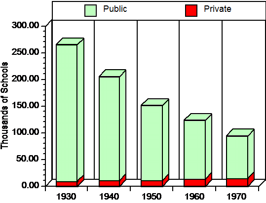
A) The three dimensional effect only makes the graph harder to read.
B) Any change in the number of private schools is difficult to see.
C) The time intervals on the abscissa are too broad.
D) a and b but not c
Correct Answer:
Verified
Q5: In the text there was a stem-and-leaf
Q6: Someone asks you if you have seen
Q7: Which of the following is the least
Q8: Assume that we had the following set
Q9: If you created a stem-and-leaf display of
Q11: The "real lower limit" of an interval
Q12: If you created a stem-and-leaf display of
Q13: Inglehart (1990) presented data on the mean
Q14: On October 25, 1978 the Washington Post
Q15: "5s" represents what numbers on a stem-and-leaf
Unlock this Answer For Free Now!
View this answer and more for free by performing one of the following actions

Scan the QR code to install the App and get 2 free unlocks

Unlock quizzes for free by uploading documents