The following graph shows the supply of and demand for baseballs in the United States. If the world price is $3 per baseball and a tariff of $1 per baseball is imposed, the net welfare loss of the tariff is shown by the area _____.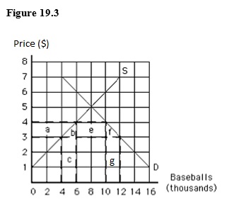
A) g
B) c
C) a
D) c and g
E) b and f
Correct Answer:
Verified
Q75: The following graph shows the demand for
Q76: The following graph shows the supply of
Q77: The following graph shows the supply of
Q78: The following image shows the market for
Q79: The following graph shows the supply of
Q82: The World Trade Organization (WTO):
A)became,in 1995,the institutionalized
Q83: Which of the following was one of
Q88: One of the main motives for the
Q99: The General Agreement on Tariffs and Trade
Q136: The largest regional trading bloc is the
A)North
Unlock this Answer For Free Now!
View this answer and more for free by performing one of the following actions

Scan the QR code to install the App and get 2 free unlocks

Unlock quizzes for free by uploading documents