The following graph, depicting the foreign-born (immigrant) population in the United States (US) from 1850 to 2010, best supports which of the following conclusions? 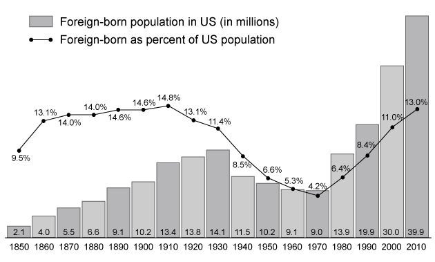
A) Compared to 1910, there was a decrease in pull factors driving immigration to the US in 2010
B) From 1910 to 1930, the fertility rate of the US population exceeded that of the immigration rate
C) From 1940 to 1970, the mortality rate of the US foreign-born population declined
D) From 1980 to 2010, the foreign-born fertility rate exceeded the native-born fertility rate
Correct Answer:
Verified
Q245: Passage
Patients undergoing chemotherapy frequently experience a number
Q246: Passage
In 2010, the United States (U.S.) had
Q247: Compared to women's social networks, men's social
Q248: Passage
During the 1800s, the United States (U.S.)
Q249: Passage
Patients undergoing chemotherapy frequently experience a number
Q251: In a surgical residency program that does
Q252: Passage
Patients undergoing chemotherapy frequently experience a number
Q253: Passage
Patients undergoing chemotherapy frequently experience a number
Q254: Passage
Patients undergoing chemotherapy frequently experience a number
Q255: A patient who has been diagnosed with
Unlock this Answer For Free Now!
View this answer and more for free by performing one of the following actions

Scan the QR code to install the App and get 2 free unlocks

Unlock quizzes for free by uploading documents