Refer to the figure.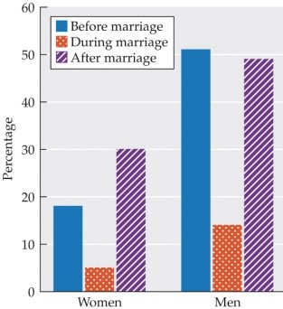 The bar graph shows the percentage of women and men born between 1943 and 1952 who said they had had more than one new sex partner at different life stages. The blue (left-most) bars show data from before marriage. The orange dotted (center) bars show data during marriage, and the purple striped (right-most) bars show data after marriage. Assuming these data reflect the general population, what conclusion can be drawn from this data?
A) Women are less likely than men to be monogamous throughout their lives.
B) Both men and women have more sex partners before their first marriage than after their first marriage.
C) Neither men nor women are virgins when they get married.
D) Men and women engage in extra-pair sex at the same rate.
E) More men than women engage in non-monogamous relationships.
Correct Answer:
Verified
Q44: Aiden secretly monitors his girlfriend's phone for
Q45: Ayesha has been taking her partner for
Q46: Which person is likely to be hurt
Q47: Refer to the figure. Q48: Which statement accurately describes cybersex? Q50: What have twin studies revealed about infidelity? Q51: How common is infidelity in committed relationships? Q52: A researcher wants to gather accurate data Q53: Discuss the history of antimiscegenation statutes in Q54: Describe a typical hookup and the risks![]()
A) Only about
A)
A)
Unlock this Answer For Free Now!
View this answer and more for free by performing one of the following actions

Scan the QR code to install the App and get 2 free unlocks

Unlock quizzes for free by uploading documents