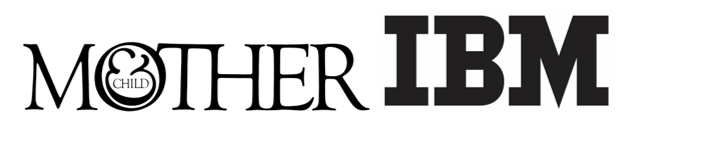
 The logos created by Herb Lubalin for Mother & Child (figure 9.20) and Paul Rand for IBM (figure 9.21) show two very different uses of type. One logo seems more classic, and the other appears more modern. Give examples of two logos that have similar feels and explain why they give off comparable impressions, considering main strokes, serifs, and overall letterforms.
Correct Answer:
Verified
Q20: Interactive digital media can have more challenges
Q21: Because everyone needs to interpret a graphic
Q22: A picture of stairs and a door
Q23: One of the things that can affect
Q24: One way to establish structure in the
Q25: When only type is used, a trademark
Unlock this Answer For Free Now!
View this answer and more for free by performing one of the following actions

Scan the QR code to install the App and get 2 free unlocks

Unlock quizzes for free by uploading documents