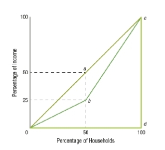
(Figure: Distribution of Income) Of the three line segments shown, which represents the MOST unequal distribution of income?
A) 0ac
B) 0bc
C) 0dc
D) The worst possible distribution of income is not shown on this graph.
Correct Answer:
Verified
Q28: Since 1970, which quintile(s) has(have) increased in
Q29: In the latest U.S. Census data, the
Q30: About what percentage of national income does
Q31: (Figure: Distribution of Income) _ represents an
Q32: (Figure: Distribution of Income) Of the three
Q34: The _ rank(s) households of various income
Q35: The Lorenz curve typically breaks income distribution
Q36: The Lorenz curve is based on
A) before-tax
Q37: The Lorenz curve uses the
A) functional distribution
Q38: The importance of the Lorenz curve is
Unlock this Answer For Free Now!
View this answer and more for free by performing one of the following actions

Scan the QR code to install the App and get 2 free unlocks

Unlock quizzes for free by uploading documents