Aggregate demand and supply curves have been widely used to analyze the performance of the macroeconomy.Figure 5-3 shows four diagrams that represent different changes in the macroeconomy.Choose the diagram that best represents the situations described in the following questions.
Figure 5-3 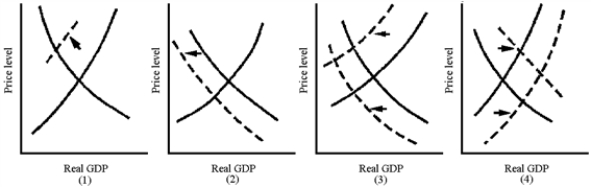
-Which graph in Figure 5-3 best represents the supply-side shock of the 1970s oil crisis?
A) 1
B) 2
C) 3
D) 4
Correct Answer:
Verified
Q178: Government policy to reduce unemployment and increase
Q179: The worst post-World War II recession in
Q180: The significantly high rates of inflation in
Q181: To fight inflation, the government may
A)decrease aggregate
Q182: Figure 5-2 Q184: A rightward shift in the aggregate demand
![]()
Unlock this Answer For Free Now!
View this answer and more for free by performing one of the following actions

Scan the QR code to install the App and get 2 free unlocks

Unlock quizzes for free by uploading documents