Multiple Choice
Figure 17-5
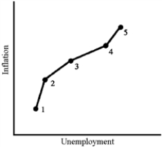
-The data illustrated in Figure 17-5 would be most representative of which decade?
A) the 1960s
B) the 1970s
C) the 1980s
D) the 1990s
Correct Answer:
Verified
Related Questions
Q100: Figure 17-4 Q103: Which of the following led to the Q105: One reason why the Phillips curve "broke
![]()

