The following question are based on the following graph:
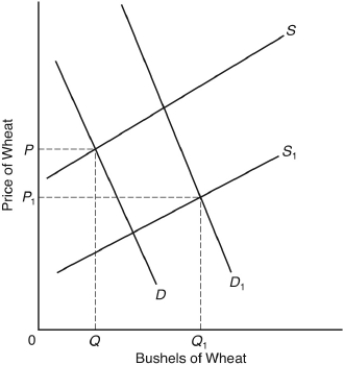
The curves D and S represent the market demand and supply curves for wheat in 1960. The curves D₁ and S₁ represent the market demand and supply curves in 2000. Assume there were no support programs in either year.
-In the graph
A) demand rose and supply fell.
B) demand fell and supply rose.
C) both demand and supply fell.
D) both demand and supply rose.
E) demand and supply remained unchanged, but the quantity demanded rose and the quantity supplied fell.
Correct Answer:
Verified
Q1: When an increase in the price of
Q3: The U.S.economy may be best characterized as
Q4: A significant increase in the toll rates
Q5: A fall in which of the following
Q6: If 1,375 seats were available at any
Q7: Changes in which of the following would
Q8: A market demand curve
A) shifts as the
Q9: The following question are based on the
Q10: A change in demand means that there
Q11: New residents moving into a growing community
Unlock this Answer For Free Now!
View this answer and more for free by performing one of the following actions

Scan the QR code to install the App and get 2 free unlocks

Unlock quizzes for free by uploading documents