Which of the following graphics would better illustrate how the complexity of interactions increases as more people are added to a communication situation? 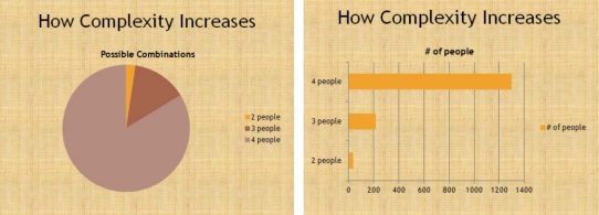
A) the pie chart
B) the bar chart
C) either of the charts will do equally well
D) neither of the charts are acceptable
Correct Answer:
Verified
Q11: Filling silence with "ums," "uhs," and so
Q12: Pausing to let an idea sink in
Q13: Which of the following is not considered
Q14: Which is not a reason for using
Q15: What is the primary problem with this
Q17: Which of the following is not contained
Q18: Which is not a way to improve
Q19: Notations on an outline that tell a
Q20: _ the speech is the best way
Q21: The way we deliver a speech affects
Unlock this Answer For Free Now!
View this answer and more for free by performing one of the following actions

Scan the QR code to install the App and get 2 free unlocks

Unlock quizzes for free by uploading documents