The following graph shows the percent of adults who are overweight or obese in countries with different income levels, based on 2010 data from the World Health Organization and the United Nations.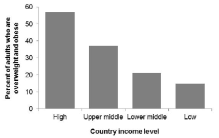 What is the correct description of this graph?
A) Bar graph
B) Histogram with a clear right skew
C) Histogram with a clear left skew
D) Boxplot
Correct Answer:
Verified
Q16: For a biology lab course containing
Q17: A sample of 55 streams in severe
Q18: A sample of 55 streams in severe
Q19: A sample of 55 streams in severe
Q20: The following table shows the percent
Q22: The following graph shows the percent of
Q23: The estimated annual number of smoking-attributable
Q24: The estimated annual number of smoking-attributable
Q25: The following histogram shows body temperatures (in
Q26: The following histogram shows body temperatures (in
Unlock this Answer For Free Now!
View this answer and more for free by performing one of the following actions

Scan the QR code to install the App and get 2 free unlocks

Unlock quizzes for free by uploading documents