The following graph shows the percent of adults who are overweight or obese in countries with different income levels, based on 2010 data from the World Health Organization and the United Nations.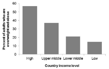 Which of the following statements about these data is correct?
A) The majority of adults who are overweight or obese live in high-income countries.
B) The majority of adults who live in high-income countries are overweight or obese.
C) Both statements are correct.
D) Both statements are incorrect.
Correct Answer:
Verified
Q17: A sample of 55 streams in severe
Q18: A sample of 55 streams in severe
Q19: A sample of 55 streams in severe
Q20: The following table shows the percent
Q21: The following graph shows the percent of
Q23: The estimated annual number of smoking-attributable
Q24: The estimated annual number of smoking-attributable
Q25: The following histogram shows body temperatures (in
Q26: The following histogram shows body temperatures (in
Q27: A sample of 40 endangered species was
Unlock this Answer For Free Now!
View this answer and more for free by performing one of the following actions

Scan the QR code to install the App and get 2 free unlocks

Unlock quizzes for free by uploading documents