The following graph shows the percent of adult hemodialysis patients who received adequate dialysis (urea reduction ratio 65% or greater) , by age, over the 2002-2007 period.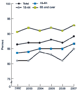 Which of the following statements about these data is NOT correct?
A) From 2002 to 2007, the overall percent of adult hemodialysis patients receiving adequate dialysis improved from about 86% to about 89%.
B) Comparing 2002 to 2007 data, improvements in the percent of adult hemodialysis patients receiving adequate dialysis were observed among all age groups.
C) In all years, adults age 18-44 and 45-64 were less likely than adults age 65 and older to receive adequate dialysis.
D) From 2002 to 2007, data for adults age 18 to 44 indicate a clear cyclical pattern.
Correct Answer:
Verified
Q27: A sample of 40 endangered species was
Q28: The following dotplot shows migraine intensity (on
Q29: The following histogram depicts the prevalence rates
Q30: The following histogram shows the yearly number
Q31: The following histogram shows the yearly number
Q33: Opioid pain relievers are prescribed at a
Q34: The following time plot gives the number
Q35: Every month, the Gallup polling organization tracks
Q36: Every month, the Gallup polling organization tracks
Q37: The U.S. Global Change Research Program examined
Unlock this Answer For Free Now!
View this answer and more for free by performing one of the following actions

Scan the QR code to install the App and get 2 free unlocks

Unlock quizzes for free by uploading documents