The plot below describes the relationship between the time spent in hours watching television per week (y-axis) and the time it takes to run half a mile in minutes (x-axis) in a sample of individuals.
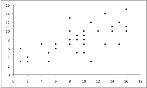 Does the graph illustrate a univariate or bivariate display? What does the graph tell you about the relationship between the two variables?
Correct Answer:
Verified
View Answer
Unlock this answer now
Get Access to more Verified Answers free of charge
Q34: Sampling distributions of means will always tend
Q35: The p value is a conditional probability
Q36: To be able to conduct a power
Q37: A histogram displays the frequency of data
Q38: Outliers are not displayed in a box-and-whisker
Q39: Box-and-whisker plots are most suited for displaying
Q40: The data below are from Jason's study
Q41: Phoebe has analyzed her data under the
Q43: State two criticisms of null hypothesis significance
Q44: Define a confidence interval. Describe the relationship
Unlock this Answer For Free Now!
View this answer and more for free by performing one of the following actions

Scan the QR code to install the App and get 2 free unlocks

Unlock quizzes for free by uploading documents