Which of the following graphs correctly represents an increase in the risk premium on the MP curve?
A) 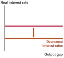
B) 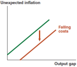
C) 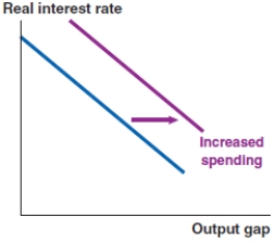
D) 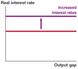
Correct Answer:
Verified
Q50: The second step in analyzing a macroeconomic
Q51: The third step in analyzing a macroeconomic
Q52: Which of the following graphs correctly represents
Q53: Which of the following graphs correctly represents
Q54: Which of the following graphs correctly represents
Q56: Which of the following graphs correctly represents
Q57: Which of the following graphs correctly represents
Q58: Which of the following graphs correctly represents
Q59: If the government lowers corporate taxes, which
Q60: If the U.S. dollar appreciates, which of
Unlock this Answer For Free Now!
View this answer and more for free by performing one of the following actions

Scan the QR code to install the App and get 2 free unlocks

Unlock quizzes for free by uploading documents