(Figure: Market for Juice) Use the figure to answer the question.
You are studying the demand for Minute Maid and Tropicana orange juice. Minute Maid improves the taste of its juice and people start preferring Minute Maid over Tropicana. Which graph depicts the impact of these changes on both Minute Maid and Tropicana?
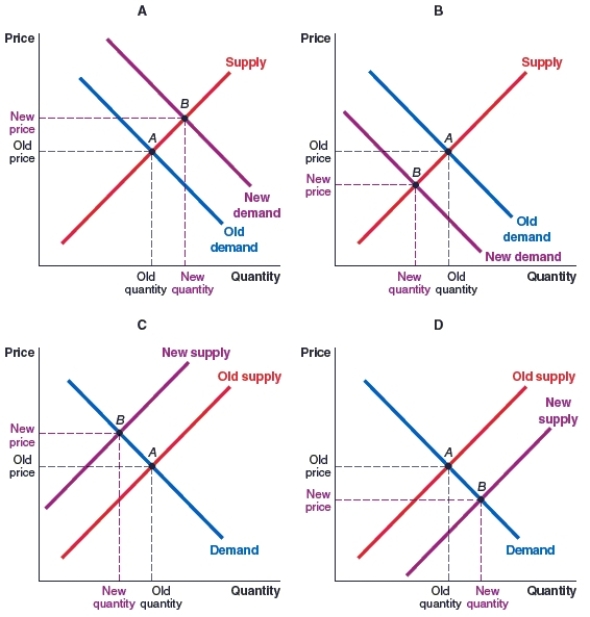
A) Graph A shows what happens in the market for Minute Maid, and Graph D shows what happens in the market for Tropicana.
B) Graph A shows what happens in the market for Minute Maid, and Graph B shows what happens in the market for Tropicana.
C) Graph B shows what happens in the market for Minute Maid, and Graph A shows what happens in the market for Tropicana.
D) Graph B shows what happens in the market for Minute Maid, and Graph D shows what happens in the market for Tropicana.
Correct Answer:
Verified
Q56: (Figure: Shift in Demand 2) Use the
Q57: There are empty candy shelves at Walmart
Q58: (Figure: Market for Shrimp) Use the figure
Q59: (Figure: Market for Train Rides) Use the
Q60: (Figure: Market for Used Books) Use the
Q62: (Figure: Market for Cars) Use the figure
Q63: (Figure: Market for Canadian Goods with US
Q64: (Figure: Market for Canadian Goods with US
Q65: (Figure: Canadian Demand for Floridian Cruises) Use
Q66: (Figure: Canadian Demand for US designer goods)
Unlock this Answer For Free Now!
View this answer and more for free by performing one of the following actions

Scan the QR code to install the App and get 2 free unlocks

Unlock quizzes for free by uploading documents