The bell-shaped curve at the top of the figure below shows the distribution of a phenotype in a population at the start of an experiment. The three graphs (lettered A-C) beneath predict what the distribution will look like if a certain type of selection occurs. Which graph represents what the phenotypic distribution will look like if the population undergoes stabilizing selection? 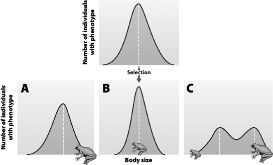
A) Graph A
B) Graph B
C) Graph C
D) These graphs all show natural selection, but none show stabilizing selection.
Correct Answer:
Verified
Q49: A student with Strep throat (caused by
Q50: A scientist is studying beak length in
Q51: Two populations of geese live near each
Q52: Which of the following is not a
Q53: In the Hardy-Weinberg equation, _ represents the
Q55: Genetic drift causes random changes in _
Q56: A few members of a species establish
Q57: Disruptive selection operates whenever
A)natural selection is disrupted
Q58: The color of a certain species of
Q59: The shell of a particular species of
Unlock this Answer For Free Now!
View this answer and more for free by performing one of the following actions

Scan the QR code to install the App and get 2 free unlocks

Unlock quizzes for free by uploading documents