The following figure illustrates the demand and supply curves for a good in a competitive market.
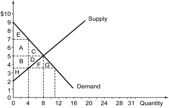
-Refer to the figure above.Suppose a price control of $3.50 is imposed on this market.Which areas on the graph represent the deadweight loss in this market due to this price policy?
A) F + G
B) A + B + C + D + E + H + F + G
C) A + B + C + D + E + H
D) C + D
Correct Answer:
Verified
Q193: The following figure illustrates the demand and
Q194: Is the invisible hand likely to work
Q195: Scenario: The figure on the left shows
Q196: The following figure illustrates the demand and
Q197: After the imposition of the price controls,
Q199: Scenario: The figure on the left shows
Q200: The following figure illustrates the demand and
Q201: Why is it likely that a market
Q202: Historical evidence suggests that _.
A) command economies
Q203: The following figure shows the demand and
Unlock this Answer For Free Now!
View this answer and more for free by performing one of the following actions

Scan the QR code to install the App and get 2 free unlocks

Unlock quizzes for free by uploading documents