The pie chart below shows the market shares of various desktop operating systems in 2013 (http://www.netmarketshare.com/) .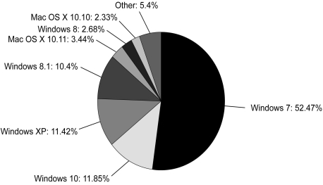
Different operating systems have different look and feel and different features from one another.Based on this information,which of the following best describes the structure of desktop OS market?
A) A monopoly
B) A monopolistic competition
C) An oligopoly with differentiated products
D) An oligopoly with homogeneous products
Correct Answer:
Verified
Q3: The difference between an oligopoly with differentiated
Q3: U)S.Code Title 18 § 1696 states
Whoever establishes
Q4: _ is a market structure in which
Q5: Goods that are similar but are not
Q6: Differentiated products can be found in _.
A)
Q7: _ are examples of differentiated goods.
A) Books
Q9: The U.S.car manufacturing industry is an example
Q11: _ is a market structure in which
Q12: Differentiate between oligopoly and monopolistic competition on
Q13: Which of the following is an example
Unlock this Answer For Free Now!
View this answer and more for free by performing one of the following actions

Scan the QR code to install the App and get 2 free unlocks

Unlock quizzes for free by uploading documents