The following figure shows the cost curves on a firm that operates in a competitive market. Assume that all the firms in this market have identical cost structure.
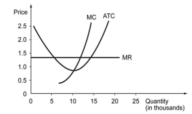
-Refer to the graph above. Which of the following graphs, correctly represents this competitive marke's demand and supply in the long run?
A) 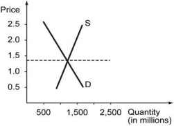
B) 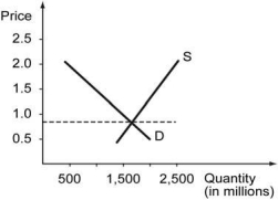
C) 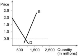
D) 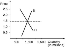
Correct Answer:
Verified
Q6: The figure below shows the marginal cost
Q7: The figure below shows the marginal cost
Q8: Define producer surplus. Calculate the producer surplus
Q9: In The Wealth of Nations, Adam Smith
Q10: The following figure shows the cost curves
Q12: Suppose the market for AR-15 style rifles
Q13: The income per capita in a country
Q14: If the aggregate income of an island
Q15: If the income per capita in United
Q16: The following table shows economic data for
Unlock this Answer For Free Now!
View this answer and more for free by performing one of the following actions

Scan the QR code to install the App and get 2 free unlocks

Unlock quizzes for free by uploading documents