Multiple Choice
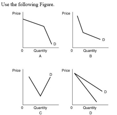
-Which of these figures best represents a typical kinked demand curve?
A) Figure A.
B) Figure B.
C) Figure C.
D) Figures A, B, and C.
Correct Answer:
Verified
Related Questions
Q97: In the kinked demand curve oligopoly model,
Q98: In the kinked demand curve oligopoly model,
Q99: In the kinked demand curve oligopoly model,
Q100: If an individual firm in an oligopolistic
Q101: The main assumption behind the kinked demand
Unlock this Answer For Free Now!
View this answer and more for free by performing one of the following actions

Scan the QR code to install the App and get 2 free unlocks

Unlock quizzes for free by uploading documents