Figure 27.8 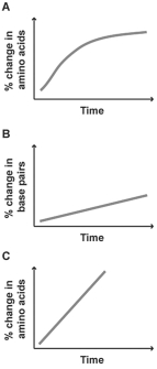
-The graphs above show percentage of change in three different molecular sequences plotted against time.Which of these molecular sequences would make a good candidate for a molecular clock?
A) Graph A,because the curve levels off over time
B) Graph B,because DNA is more important to organisms and,therefore,will give a more accurate picture of divergence
C) Graph C,because the change in sequence is the most rapid
D) Graph A or C,because changes in amino acid sequence are more likely to be neutral than changes in DNA
E) Graph B or C,because they are straight lines
Correct Answer:
Verified
Q23: Which of the following likely has the
Q28: Which statement best describes why the Cambrian
Q28: You are using a molecular clock to
Q29: You know that a particular stretch of
Q33: Deletions in mice in the Hoxa3 gene,on
Q34: Which value(s)would be required to calculate how
Q35: To use a genetic sequence as a
Unlock this Answer For Free Now!
View this answer and more for free by performing one of the following actions

Scan the QR code to install the App and get 2 free unlocks

Unlock quizzes for free by uploading documents