
Figure 3-3
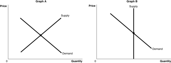
-Refer to Figure 3-3.The figure above shows the supply and demand curves for two markets: the market for an original Picasso painting and the market for designer jeans.Which graph most likely represents which market?
A) Graph B represents the market for an original Picasso painting and Graph A represents the market for designer jeans.
B) Graph A represents the market for an original Picasso painting and Graph B represents the market for designer jeans.
C) Graph A represents both the market for an original Picasso painting and designer jeans.
D) Graph B represents both the market for an original Picasso painting and designer jeans.
Correct Answer:
Verified
Q126: An increase in the price of inputs
Q127: In 2004, hurricanes damaged a large portion
Q128: Explain the differences between a change in
Q129: Figure 3-4 Q130: All else equal, as the price of Q132: A decrease in quantity supplied is represented Q133: Use the following supply schedule for cherries Q134: Indicate whether each of the following situations Q135: What is the difference between a supply Q136: Which of the following is the correct
![]()
Unlock this Answer For Free Now!
View this answer and more for free by performing one of the following actions

Scan the QR code to install the App and get 2 free unlocks

Unlock quizzes for free by uploading documents