Multiple Choice

Figure 2.5
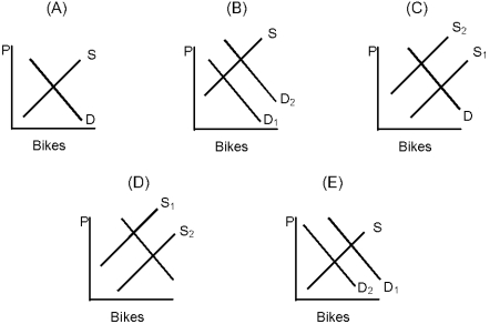
-In Figure 2.5, which graph represents what might happen if there were an increase in the price of metal used in the production of bicycles?
A) A
B) B
C) C
D) D
E) E
Correct Answer:
Verified
Related Questions
Q120: Figure 2.3 Q121: If supply and demand for a good Q122: More television sets are being sold today
![]()

