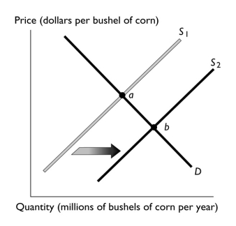
-The above figure illustrates the market for corn.If point "a" represents the original equilibrium and point "b" the new equilibrium,which of the following could have caused the change?
A) an increase in the number of corn growers
B) an increase the price of wheat, a substitute in production for corn
C) an increase in the cost of the fertilizer used to grow the corn
D) a belief among corn farmers that the price of a bushel of corn will be higher next month
E) an increase in income if corn is a normal good
Correct Answer:
Verified
Q116: If the number of sellers decreases,then the
Q117: When the price of oranges increases,
A) the
Q118: It is expected that the price of
Q119: Which of the following increases the supply
Q120: Which of the following shifts the supply
Q122: Q123: Because of the high cost of fuel,railroads Q124: Which of the following shifts the supply Q125: Q126: Unlock this Answer For Free Now! View this answer and more for free by performing one of the following actions Scan the QR code to install the App and get 2 free unlocks Unlock quizzes for free by uploading documents![]()
![]()
![]()

